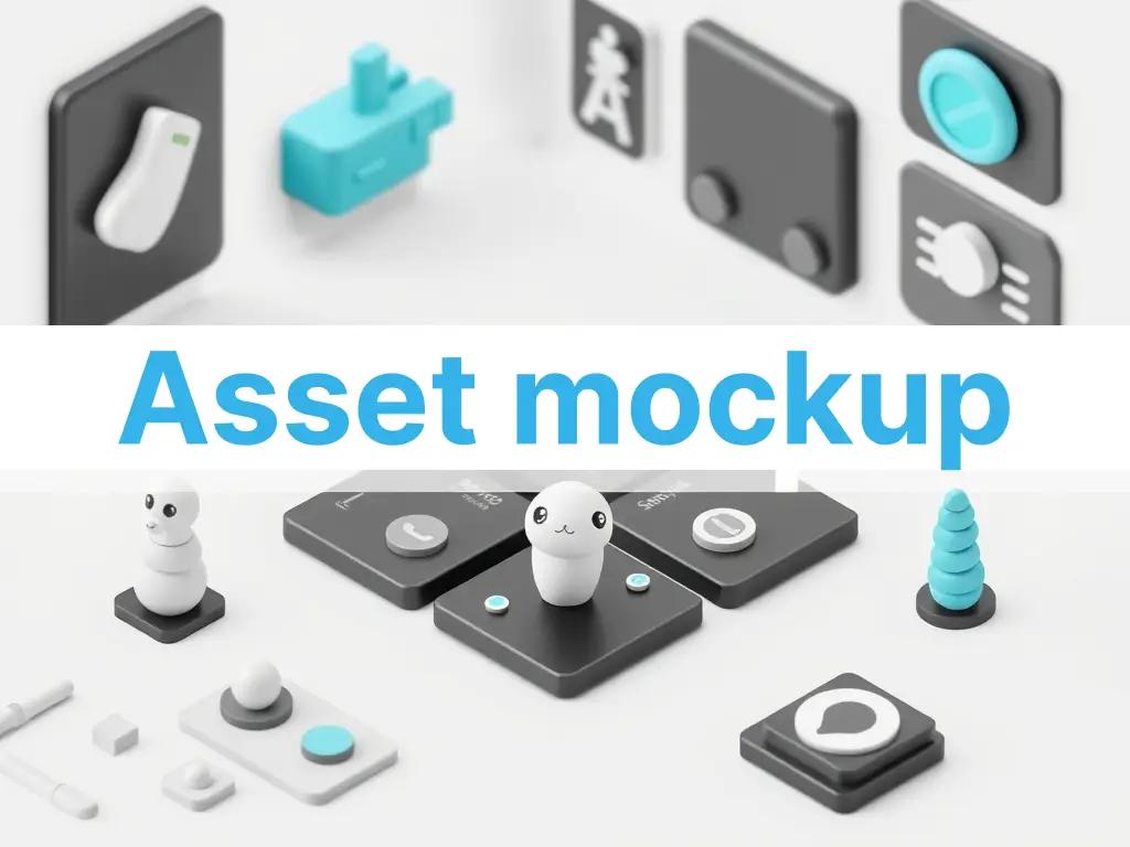
How to Mock Up an Asset Inside a React Card Grid Layout
Placing unoptimized assets into responsive card grids often triggers broken aspect ratios, container blowouts, and unexpected layout shifts. Here is how to isolate and preview your assets inside live repeating grids before production.
Try it directly in Shufaf
No signup required to preview
Card grids are the backbone of modern dashboard UIs, e-commerce stores, and software directories. But the moment you start dropping dynamic user assets, raw vectors, or uncropped screenshots into a repeating card loop, your clean CSS layout often fractures.
The typical developer workflow involves hardcoding a loop of placeholder components, refreshing localhost, and manually swapping out mock asset paths to see how they render across changing screen dimensions. If an asset has an irregular aspect ratio or a messy bounding box, it can cause immediate layout shifts, layout broken lines, or clipped elements.
There is a significantly faster way to stress-test your graphics inside a structural, interactive component grid directly in your browser.
The Hidden Complexity of Grid Card Assets
When you build a flexible layout using CSS Grid (grid-template-columns: repeat(auto-fill, minmax(280px, 1fr))) or Tailwind’s responsive grid utilities, you hand over spatial control to the browser. While text wraps cleanly, embedded media assets introduce a list of edge-case bugs:
- Aspect Ratio Collisions — A grid cell looks best when its sibling items share visual balance. Mixing an ultra-wide landscape image with a vertical portrait graphic inside a uniform card loop results in misaligned action buttons and fragmented vertical baselines.
- Cumulative Layout Shift (CLS) — If your React card components do not explicitly declare intrinsic aspect bounds for incoming images, the browser cannot reserve space during initial paint. As assets load asynchronously over the network, elements jump and pop down the page, hurting performance scores.
- Bounding Box Overflow — Design tool exports often include invisible, transparent margins around vector paths or transparent PNG icons. Dropped blindly into a compact card layout, the graphic appears artificially tiny or clips outside the container boundaries.
- Theme and Canvas Separation — Drop shadows or edge details that pop on a light dashboard background can look entirely washed out or structurally invisible when your app switches to a dark mode context token.
The Architecture of a Live Mockup Sandbox
Instead of writing throwaway local sandbox code just to test asset variations, an efficient workflow isolates the visual assets inside a dedicated component simulator. A robust component preview system handles three key responsibilities:
- Dynamic Grid Scaling Simulation — It encapsulates the asset within realistic container constraints, showing how it adapts when the grid collapses from a 4-column desktop span down to a tight mobile viewport.
- Containment Mode Strategy Toggling — It allows developers to instantly switch asset rendering behavior between structural clipping rules (
object-covervsobject-contain) to determine the exact structural code properties needed. - Real-Time Context Embedding — It contextualizes your graphic by surrounding it with true-to-life UI indicators, including actionable buttons, title badges, and metadata tags, guaranteeing the asset scales in harmony with text nodes.
Here is how to visually audit and prototype your graphic assets inside an active card grid layout using Shufaf.
Step-by-Step: Testing Assets in a Component Grid
Step 1 — Upload or Transform Your Graphic Asset
Open the Shufaf Tool. Drop your raw file directly onto the canvas. Whether you are testing an app screenshot, a 3D icon, or a product logo, you can use the built-in isolation engines—like the instant background remover or vectorization pipeline—to clean up messy bounding borders and extract a pristine asset layer.
Step 2 — Transition to the Layout Preview Canvas
With your refined asset visible on the interface, locate the right-hand layout engine control panel and toggle over to the Preview workspace view.
Step 3 — Mount the Icon Grid Template
From the layout selection directory, choose the Icon Grid Layout. The playground will immediately construct a live, multi-column dashboard grid component array, duplicating your uploaded graphic across multiple adjacent cards to replicate a production database loop.
Step 4 — Stress-Test Component Breakpoints
Interact directly with the simulation canvas variables to find breaking points:
- Modify Parent Container Widths: Drag the viewport scaling anchors to observe how the card layout behaves across mobile, tablet, and widescreen bounds.
- Toggle Global UI Themes: Switch between high-contrast light mode contexts and dark mode tokens to verify that your asset's colors, transparency layers, and outer drop-shadow parameters maintain strong legibility.
- Evaluate Content Proportions: Inspect how the graphic balances alongside typography blocks, interactive checkout links, and badge layers inside the grid row.
Step 5 — Export the Optimized React Component Code
Once you have verified the asset's layout behavior under extreme bounds, look below the viewport interface to find the automatic code generation block.
Select the React or Tailwind tab to copy a clean, modular component template that contains the exact responsive sizing primitives, semantic markup, and class declarations validated inside the sandbox.
What the Clean Component Generation Handles Under the Hood
The generated codebase structures your components defensively against unpredictable asset behaviors:
Forced Aspect Ratio Containers — The output code wraps responsive media files within fixed aspect containers, eliminating layout jumps:
export function AssetCard({ title, badge, imageUrl }) {
  return (
    <div className="flex flex-col overflow-hidden rounded-2xl border border-black/5 bg-white dark:bg-zinc-900 p-4 shadow-sm transition-all hover:shadow-md">
      {/* Aspect wrapper prevents CLS layouts */}
      <div className="relative aspect-square w-full overflow-hidden rounded-xl bg-neutral-50 dark:bg-zinc-950 flex items-center justify-center p-6">
        <img
          src={imageUrl}
          alt={title}
          className="max-h-full max-w-full object-contain transition-transform duration-300 group-hover:scale-105"
          loading="lazy"
        />
      </div>
      <div className="mt-4 flex flex-col gap-1">
        <span className="text-[10px] font-bold uppercase tracking-wider text-primary">{badge}</span>
        <h3 className="text-sm font-semibold text-gray-900 dark:text-white">{title}</h3>
      </div>
    </div>
  );
}
Prop-Driven Layout Flexibility — Rather than relying on rigid, absolute pixel bounds, root component nodes are configured to inherit dynamic layout rules cleanly from any orchestrating parent loop.
Common Implementation Use Cases
SaaS Dashboard Feature Mockups You are showcasing user integrations, plugin features, or customizable assets inside a multi-column dashboard panel. Running the graphics through a card preview sandbox ensures that distinct icons feel like they belong to the same unified design system block.
Digital Asset Marketplaces You are developing a marketplace UI or digital asset gallery component loop. Use the sandbox to verify that complex vector previews or rich raster mockups adapt smoothly when dropped inside standard product layout rows.
Responsive E-Commerce Card Design You want to test how isolated product photos with varied vertical proportions fill standardized display boxes without clipping important item edges or forcing product descriptions to sit unevenly.
Layout Approach Breakdown
| Layout Strategy | Cumulative Layout Shift (CLS) Risk | Responsive Scaling Resilience | Styling Control Override |
|---|---|---|---|
| Raw Image Tags without Explicit Bounds | Extremely High (Elements jump during paint) | Vulnerable to structural clipping | Very Poor |
Fixed Inline Dimensions (px height/width) | None | Completely rigid (Breaks column fluidity on mobile layout viewports) | Poor |
| Aspect-Bounded Flex Boxes (Shufaf Framework) | Zero (Space is calculated natively up front) | Absolute (Fluid alignment across mobile and desktop) | Complete (Clean control via external Tailwind classes) |
Eliminate Layout Guesswork
Stop spending development sprint hours writing disposable layout test files. Upload your design files into Shufaf to optimize bounds, simulate live multi-card arrays, and harvest clean, layout-defensive component structures instantly.
→ Launch the Shufaf Card Grid Mockup Preview Sandbox